3. Tick Rule
Suppose we have tick data that's limited to time, price and volume. To get an estimate if a trade is an agressive buyer or seller, we can apply the tick rule. The tick rule is simple: if price is above the previous trade price, then it's a buy order, if below the previous trade price, then it's a sell order. Otherwise, take on the value of the previous trade. Let's dive in.
First, import some libraries. We'll use plotly for graphing, the arrow package for datetime manipulation, and of course polars for managing the data.
import polars as pl
import plotly.graph_objects as go
from plotly.subplots import make_subplots
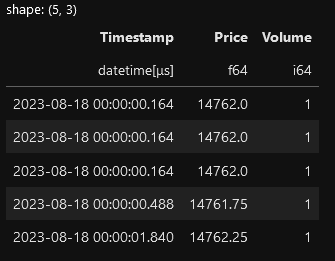
import arrowTake a quick scan of the data. I'm using the NQ emini futures data for this exercise. The data file can be found in my github account link at the end.
tick_directory = "./data/tick"
filename = f"{tick_directory}/NQ_09_23.20230818.parquet"

(pl.scan_parquet(filename)
    .fetch(5)
)
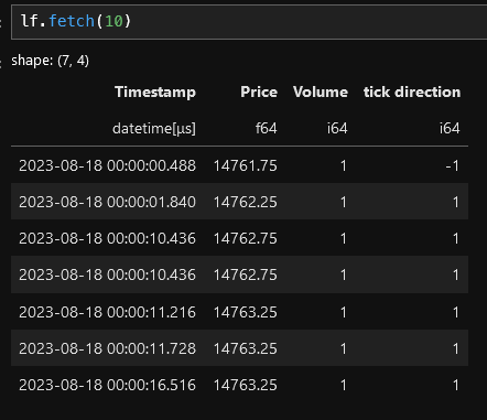
Here's a polars recipe for applying the tick rule. It seems long but here's the highligts:
- Sort the data
- Apply the tick rule by using polars' when() function to create a "tick direction" column (-1 for sells, 1 for buys and None for everything else).
- Use the fill_null() function to replace the nulls with the previous value by using the forward fill strategy.
- Mulitply the tick direction column by the volume to get the buy or sell volume as a positive or negative number
- Drop nulls. These will appear an the beginning of the data set since there's no way to determine price based on previous prices.
lf = (pl.scan_parquet(filename)
    # sort the data
    .sort("Timestamp")
    # use the when function to determine the direction.
    .with_columns(
        # if the current price > previous price, then set the
        # "tick direction" column to 1.  If the current
        # price < previous price, the set the "tick direction" column
        # to -1. Otherwise, set the value to None.
        pl.when(pl.col("Price") > pl.col("Price").shift())
            .then(pl.lit(1))
            .when(pl.col("Price") < pl.col("Price").shift())
            .then(pl.lit(-1))

            # if the prices are equal, then fill in with "None" or null
            .otherwise(pl.lit(None))

            .alias("tick direction")
    )

    # use the fill_null function to fill in the null values
    # using the forward (fill) strategy
    .with_columns(
       pl.col("tick direction").fill_null(strategy="forward")
    )

    # multiply the volume column by the tick direction column
    # to get the bid/ask volume
    .with_columns(
        (pl.col("Volume") * pl.col("tick direction")).alias("tick direction")
    )

    # the first few rows will have a null tick direction value, so
    # we'll drop these
    .drop_nulls()
)
We still have a lazy frame, so let's do something interesting with this. Let's plot the 5 minute bars. To do that, we first have to resample the data. With polars, this is easy.
The high level:
- Filter the data from 8am to 16:15. This step is not really necessary but it will keep the plotting tidy later on.
- Resample the data into 5 minute ("5m") intervals. Aggregate the price into Open, High, Low and Close by using the first(), max(), min() and last() functions, repsectively. Volume is simply summed up for the interval and "tick direction" is summed to become the delta (difference between the ask and bid volume).
- Finally, use the cumsum() function to get the cumulative delta.
interval="5m"
# using the time interval bars.
lf2 = (lf
    # first, limit what data we want to look at
    .filter(
        pl.col("Timestamp").is_between(
            arrow.get("2023-08-18 08:00").datetime.replace(tzinfo=None),
            arrow.get("2023-08-18 16:15").datetime.replace(tzinfo=None)
        )
    )
    .sort("Timestamp")

    # resample the data
    .groupby_dynamic("Timestamp", every=interval)
    .agg(
        pl.col("Price").first().alias("Open"),
        pl.col("Price").max().alias("High"),
        pl.col("Price").min().alias("Low"),
        pl.col("Price").last().alias("Close"),
        pl.col("Volume").sum().alias("Volume"),

        # the "tick direction" column contains the +/- volume
        # so summing this will get the delta
        pl.col("tick direction").sum().alias("Delta")
    )

    # then use the cumsum() function to keep a running total the delta.
    # i.e. cumulative delta
    .with_columns(
        pl.col("Delta").cumsum().alias("Cumulative Delta")
    )
)
Next, we'll plot the newly minted data. Plotly makes this easy.
fig = go.Figure()

candlestick_trace = go.Candlestick(
            x=df["Timestamp"],
            open=df['Open'],
            high=df['High'],
            low=df['Low'],
            close=df['Close']
        )

fig.add_trace(candlestick_trace)

fig.update_layout(
    title=f"NQ - {chart_date.format('YYYY-MM-DD')}",
    height=600,
    width=1000,
    template="plotly_dark",
    xaxis_rangeslider_visible=False,
    showlegend=False
)

fig.show() 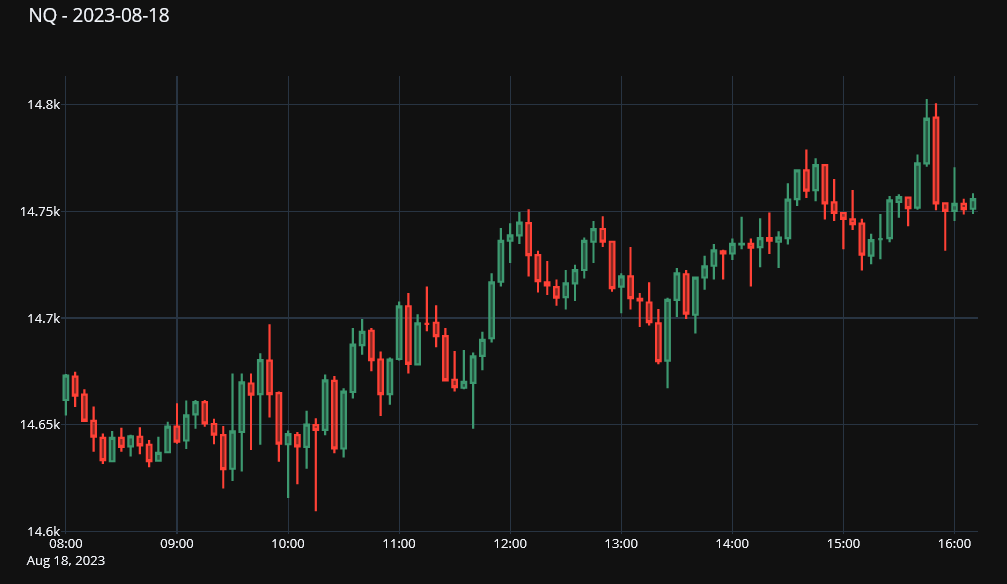
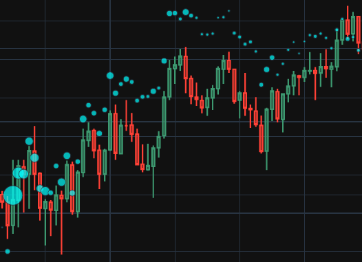
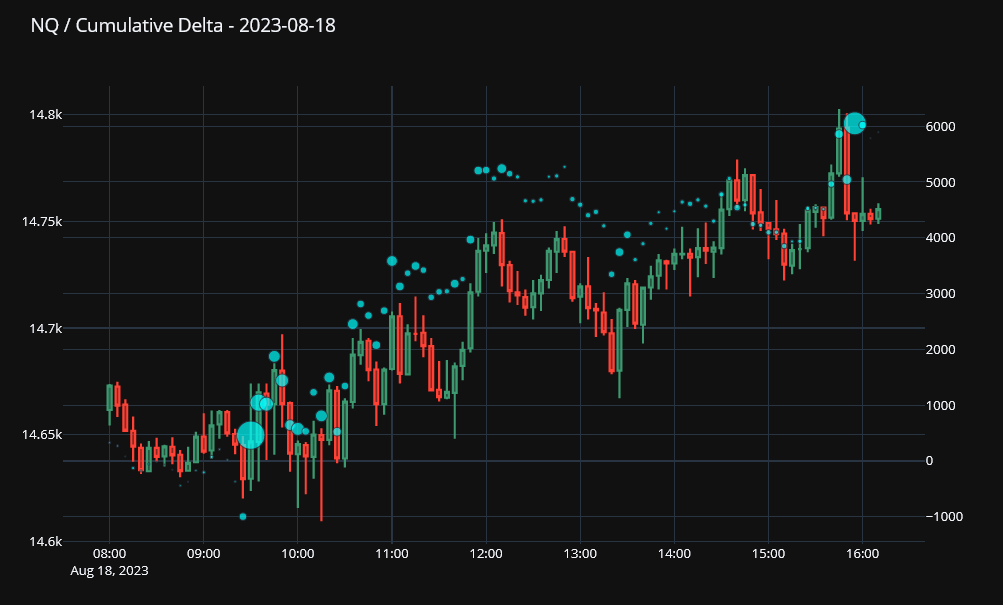
Finally, let's overlay the cumulative delta on the chart itself. To do that, we'll have to split the figure into left and right axis: the candlestick chart will go on the right and cumulative delta on the left. The cumulative delta is added as a scatter plot, but ot make things interesting, we can scale the size of the markers relative to the volume of the bar.
...
markers = dict(
    size = [int(x*.001) for x in df.get_column("Volume")],
    color = ["cyan"]* df.get_column("Volume").shape[0]
)
cumulative_delta_Trace = go.Scatter(
        x=df['Timestamp'],
        y=df['Cumulative Delta'],
        name='Cumulative Delta',
        mode="markers",
        marker=markers
    )

fig.add_trace(cumulative_delta_Trace, secondary_y=True)
...
Link to the notebook: https://github.com/cbritton/Notebooks/blob/main/3.Tick%20Rule.ipynb